Taxi Driver Season 3 Isn’t Just a Drama — It’s TV That Feels Like a Movie
Model Taxi Season 3 isn't just a drama anymore—it's basically watching a film every episode. The art director behind the scenes breaks down how meticulous color concepts and set design transformed each storyline into something cinematic that has fans saying they forgot they were watching a TV show.
The Drama That Looks Like a Feature Film
Let’s get this straight: *Taxi Driver Season 3* didn’t just break its own records with a **19.1% viewership spike** — it made people say, *“I swear I was watching a movie, not a TV drama.”* That’s not random chatter. That’s how fans around the world are reacting to the visual ambition behind every frame. :contentReference[oaicite:1]{index=1}
People aren’t just tuning in — they’re watching like cinephiles dissecting shots. And it all comes down to one person’s vision: art director Kim Bo-young, who’s been elevating this series since Season 2 and turned what could’ve been standard TV into cinematic storytelling. This isn’t TV production. This is visual filmmaking.
The Color Theory Behind Every Episode
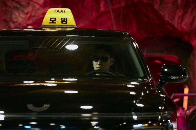
Here’s where it gets next-level. Instead of random sets, **every episode pair** in *Taxi Driver Season 3* has a unique color concept crafted into the DNA of the story. Episodes 1–2 dive into blues that evoke oceanic depth, tattoos, and tension. Episodes 3–4 switch to black and white, creating a stark film-noir feel that reshapes mood and narrative. That level of intentional visual styling? That’s cinematic language, not TV decoration.
And it’s not superficial. Every prop, piece of furniture, and background object is matched to the palette. When you watch, you feel it — the mood, the theme, the aesthetic. That’s storytelling through visuals, not just narrative.
Set Design That Tells Story
One moment people keep talking about is the nursing home sequence in episode 5. Instead of a static set, the space — from hospital rooms to a clock shop to outdoor gardens — is designed like a visual journey. The clock shop in particular becomes symbolic: time slipping away, memories fading, reality blurring. Darker tones narrow the frame as the scene progresses, and elements like wooden furniture and puppet figures nod to deeper meaning. This is design that *speaks.*
Every Villain Gets Their Own Visual Identity
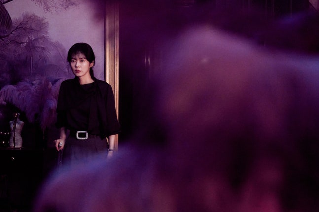
The antagonists this season aren’t just plot foils — they have **visual worlds** that express their psychology. Matsuda, introduced early on, is shrouded in mist and veiled blues, keeping the viewer at arm’s length and building tension. Cha Byung-jin’s scenes turn stark and harsh, light and shadow tearing his frame apart — literally showing his dual nature.
Other villains bring entirely different vibes: retro purple and yellow dreamscapes, decaying spaces like abandoned schools and empty pools — each setting is a visual character of its own. Every villain’s look tells you who they are before they even speak.
Continuity That Honors Fans
Fans of the show know one beloved Season 2 set — the underground repair shop of the Rainbow Dark Heroes. In Season 3, that set was completely dismantled after production ended. Instead of dropping it entirely, Kim rewatched footage endlessly to rebuild it with precision, then wove in *Season 3’s signature red palette* so it felt fresh while honoring its history. That’s the kind of fan-smart design that turns attention into genuine connection.
Why This Actually Matters
K-dramas have been getting more cinematic for years, but *Taxi Driver Season 3* represents something specific: the ambition to make television **as visually intentional and narratively layered as film**. Every department — lighting, cinematography, sets, color — marched toward the same creative vision. That kind of coordination rarely happens without budget, trust, and a unified artistic push.
With the last four episodes still to air, fans are already rewatching earlier ones just to catch subtle visual details they missed the first time. That’s not casual watching — *that’s cinephile engagement.*
Alex Chen
Cultural analyst with deep insights into K-content and industry trends. Known for thoughtful essays that blend criticism with accessibility.
Contact AlexLatest Articles


